
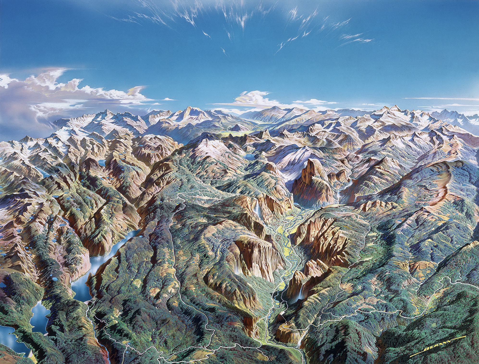
One of the most common types of reference map is topographic with contours that represent changes in elevation. It is actually quite easy to produce this kind of a map using GIS programs such as ESRI ArcMap. All one needs is a Digital Elevation Model (DEM) of a landscape and within a few clicks you can have a decent looking model of the terrain. Generally, a pure USGS topo map just shows the elevation with the use of the contours set at intervals, and some simple symbolization for ground cover, such as green areas for forest. This exercise incorporates shaded relief, hypsometric tints, and contour lines to display the landscape in a more realistic fashion. Since we can, why not have the best of all worlds? The tutorial for this entire process can be downloaded here, and a great data source for the data is the GeoCommunity website. Also, after working on this, I found it easier to locate a given quadrangle at the USGS Map Locator website. So experiment with the techniques and the next time you go hiking, impress the partners with your own custom topographic masterpiece!
Sunday, April 11, 2010


Sunday, February 14, 2010
Illustrator Selection Tools
The Selection Tool and its partner, the Direct Selection Tool, are like wrenches for a mechanic: they’re indispensible. These tools let the artist manipulate artwork by selecting and moving the anchor points and lines that comprise a vector drawing. In this video, I go through the basic operations and reveal some of the hidden extras that the Alt and Shift keys add. One tip that got cut in the editing room (against the will of the actor!), was to hold down Shift and click on multiple anchors or objects to select more than one at a time. Then they can be moved all together, like a herd of cats. Take the time to learn the keyboard shortcuts as you use Illustrator, and you’ll be a wizard in no time.
Thursday, February 11, 2010
Tracing In Illustrator - Common Cartographic Process

For this exercise, you will be tracing, styling and labeling a map of a fictional golf course using Adobe Illustrator. Tracing is a common practice in cartography; whether it’s an aerial photo, a satellite image, an existing paper map, or duplicating vector artwork as we will do here. In a commercial application, one has to be mindful of copyright before tracing other people’s work, but for an academic exercise, there is less of a concern.
Before you begin, please take the time to run through the tutorials linked here at this blog. The University of Michigan has a great Illustrator Reference Guide as well. Ignore these resources at you own peril!! Illustrator is a complicated and deep program that takes years to learn. However, the basics can be mastered fairly quickly if the initiative is taken to gain a thorough understanding of the most important tools and concepts. At a minimum, I suggest that you research the use of the Selection Tools, the Pen Tool, the Shape Tools (Rectangle, Ellipse, etc.), and the Type Tool. You should also learn about the Layers Panel, the Stroke Panel, the Character Panel, the Color Panel, and the Swatch Panel. Type any of these names into the Help menu within Illustrator to get an overview. Countless other tutorials on the web will broaden your knowledge. To get you started, I will walk through the steps to set up your document and trace the first layer. After that, get busy and get into it!
- Download the golf course map image named “Golf_Map_MP.tif” here.
- Open Adobe Illustrator and choose Create New → Print Document from the welcome screen.
- In the Pop-up, name the document, leave the default size at Letter – 8.5” x 11”, select landscape orientation, and click OK.
- In the Menu, go to File →Place, and then navigate to the “Golf_Map_MP.tif” image. Make sure the Link box is not checked and click Place.
- The Image of the golf course map will be placed in the center of the workspace. Lock that layer and name it "Map Template." Create a new layer above the first. Name the new layer “Background” and lock it. Draw the “Background” layers later so they don’t obscure the Template. Now create another layer and name it “Rough.”
- Go to the Menu and click File → Save → navigate to your project folder → check the map name → use the default Illustrator (.ai) format in Save as Type, and click Save.
Save your project frequently as you work! - Set the Stroke to a dark green and the Fill to none in the Color Panel. Tip: Use the Swatch Panel to pick your colors at first. If there are no or few colors in the Swatch Panel, go to the Drop-down at the far right of the panel, (Small carrot with three lines) and select Open Swatch Library. There you will find more colors than you can imagine!
- Select the Pen Tool and start to digitize the shape of the “Rough” on the first golf hole. Once the polygon is closed, you can fill it with color. Finish tracing the rest of the “Rough” areas, then create another Layer named “Fairways” and start to draw those shapes from the Template. Note: You will have to make the “Rough” layer invisible by clicking the Eyeball in order to see the Fairways on the template.
- Continue to recreate the Golf Map by tracing the features on the Template. Make new layers as you move up the visual hierarchy keeping them in logical order. See the layer order in the screen capture for my final map. Yours should look similar to this. Remember that the hierarchy should go from areas to lines, then points, and finally text. Think about the concepts of Figure and Ground. What belongs on the bottom, what belongs on top? What would be the most important information a golfer using this map needs to know? Make the purpose stand out!


Alright! With that you should be well on your way. Coming up will be my two cents on the basic tools and panels that need to be in every cartographer’s quiver. Hopefully some of the tips will go beyond the tutorials and into best use practices I gain from everyday mapping. I know that this is starting at a pretty basic level, and if you are already far ahead of this, hang in there. Come back often as the gems will be unearthed as time goes on. Thanks, Kevin
Sunday, February 7, 2010
Adobe Illustrator Basics
Getting started in Illustrator can be daunting to the first time user, or even someone experienced in the raster world. As a vector program, we have to remember that it’s all about points and lines. Each line has a stroke color and weight, and if we connect them, they become polygons that can be filled with any color of our choosing. If it’s day one for you in this program, I would strongly advise watching a few tutorials on the Adobe TV site. “Must See TV” should include Starting a New Document, how to work with Layers, and the operation on the Pen Tool (click on Illustrator, then Pen Tool or Layers video). With those basics, one can get started on an empty page.
Following are my intro tips to the workspace with some of the lingo for various elements. This will help decipher all the “insider” explanations on the Adobe site.
Besides all the helpful stuff at Adobe, the web is full of great resources for learning a new program. This Blog has a super list of the top 20 basic Illustrator tutorials including a highly recommended one on the Pen Tool, and a Map specific one or Two as well. Please take a couple of hours to look these over, open the program, and just play. After that, we’ll get right to making a make.
Sunday, January 24, 2010
Collaborative Mapping
The internet has really changed cartography over the last decade providing nearly everyone with the tools to make maps. Tools like Google Maps, Maker, and Open Street Map have democratized mapping in ways that no one could have predicted even twenty years ago. This plethora of mapping has been both beneficial and harmful to the profession of cartography. While it’s good to see the geographic knowledge of the general public increase, it’s also disheartening to witness the flood of trashy maps that poorly display information and pass for cartography. Some would say that cartographers are no longer needed, but I would counter that there is no time in history that they are needed more. We have to educate users and makers on what constitute acceptable cartographic conventions, what techniques best communicate information, and what pitfalls lurk when data is presented as truth, when in fact in may not be. I could write an entire post just on this subject, but let’s get back on track.
One of the most recent developments in online mapping has been the ability for multiple people to collaborate on a single mapping project. As shown in the video tutorials below, we now can all have our say and represent our opinions spatially. Imagine how useful these tools can be for professional and community decision making. Where should we put that new bike path? Do we need another liquor store near these five other locations? How many types of projects can you envision using this technology with? The tools are right at your finger tips; put them to good use!
And here are a few extra tips for working in Google Maps. I also did a video of the basic tools before I found Google's slick tutorial. It has some repeat information, but you can watch it HERE if you like. All this should be enough to get you started. Cheers!
Monday, January 18, 2010
Cartography Tools
The main tools of cartography in the digital age are all computer based. There are three types of computer programs that almost all maps are made with these days. Sometimes only one is employed, sometimes all three. Here is a short introduction.
The first are the vector drawing programs like Adobe Illustrator. They deal mainly with vector artwork, which consists of points connected by vectors, commonly known as lines. Vector artwork tends to have smaller files sizes and can be enlarged almost infinitely without losing quality. On a map, elements like roads, contours, rivers, etc. are usually drawn in vector.
The next group are tools like Photoshop that are designed to work with raster data, or pictures that are made up of many small pixels. Raster artwork can have very large files sizes and can only be enlarged to within the limits of the image resolution before degrading. Shaded relief on a map is raster data.

Raster vs. Vector
Finally there are the Geographic Information Systems. GIS programs like ESRI ArcMap deal with both vector and raster data. The big difference is that a GIS also stores the coordinates of all the map elements, locating their exact position on the earth. GIS programs are very good at analyzing spatial questions and organizing vast amounts of geographic data, but they lack precise drawing tools. Many nice maps are constructed entirely within a GIS, but for complete control of style and aesthetic appearance, most cartographers turn to graphics programs.
A common cartographic workflow would be to compile and organize all the map data in ArcMap, and then export the vectors and rasters out into separate files. The raster data would then be processed in Photoshop, while the vector data would be styled in Illustrator. Finally the raster could be placed beneath the vectors in Illustrator, and the map could be labeled and printed. Here is a map that was created in this way:

That’s one of the ways it’s done, so let’s do it!
Saturday, December 19, 2009
Purpose and Audience
The very first maps, probably drawn in the dirt with sticks, had a purpose. They showed where the game was for hunting, the easiest pass over the mountain, or the villages that were friendly or not. As we use maps today, the first thing we do, at least sub-consciously, is ask “what’s this thing telling me?” With a reference map, that’s usually easy enough. A good road map will get you through the city, a topographic map through the wilds. But what about those travesties of lines and points, type and symbols, that make no sense at all? We’ve all seen them; maps that are not! The problem is, they don’t have a purpose in life. Or maybe too many purposes! As cartographers, we should never forget to be users. Always ask; “What am I making this map for?” This becomes even more important with thematic maps, when we are trying to show more than just the lay of the land.
Occasionally, I run across a map that’s over my head. Say a map of the elementary particles in Physics. That’s not a problem of purpose, but one of audience. That map wasn’t made for me, it was made for Dr. Electron. So as cartographers, we have to keep that in mind as well. “Who am I making this map for?” Whether it’s for geniuses or layman, we have to play favorites right up front. Personally, I prefer a target audience; making a map for everyone is harder than one would think!
So the first step in map design is to define a purpose and audience. Why? Because it’s also the first step in map reading. Luckly, we have the tools to get the job done. We can lead the user with the title, legend, colors, symbols, hierarchy, and yes, even the font. The map is the stage, the elements are the actors; use them to tell the right story to the right crowd!
For fun, I like to go to a cool website like Strange Maps, and find one that catches my eye. Then, before reading the description or comments, I try to figure out the purpose and audience. What techniques were used to draw it? What elements did they use to tell me what? Were they successful? What would I do differently? Then I read further to see if I was even close. I believe that to be a good cartographer, you have to be critical of maps. You can learn a lot from details, and if nothing else, it’s a break from Facebook!
Occasionally, I run across a map that’s over my head. Say a map of the elementary particles in Physics. That’s not a problem of purpose, but one of audience. That map wasn’t made for me, it was made for Dr. Electron. So as cartographers, we have to keep that in mind as well. “Who am I making this map for?” Whether it’s for geniuses or layman, we have to play favorites right up front. Personally, I prefer a target audience; making a map for everyone is harder than one would think!
So the first step in map design is to define a purpose and audience. Why? Because it’s also the first step in map reading. Luckly, we have the tools to get the job done. We can lead the user with the title, legend, colors, symbols, hierarchy, and yes, even the font. The map is the stage, the elements are the actors; use them to tell the right story to the right crowd!
For fun, I like to go to a cool website like Strange Maps, and find one that catches my eye. Then, before reading the description or comments, I try to figure out the purpose and audience. What techniques were used to draw it? What elements did they use to tell me what? Were they successful? What would I do differently? Then I read further to see if I was even close. I believe that to be a good cartographer, you have to be critical of maps. You can learn a lot from details, and if nothing else, it’s a break from Facebook!
Subscribe to:
Posts (Atom)